KISS OF LIFE Allegedly Plagiarizes Popular Male Group’s Logo— Triggers Divided Reactions
Recently, an online community post about KISS OF LIFE’s logo for their Japanese album went viral, garnering over 43,000 views.
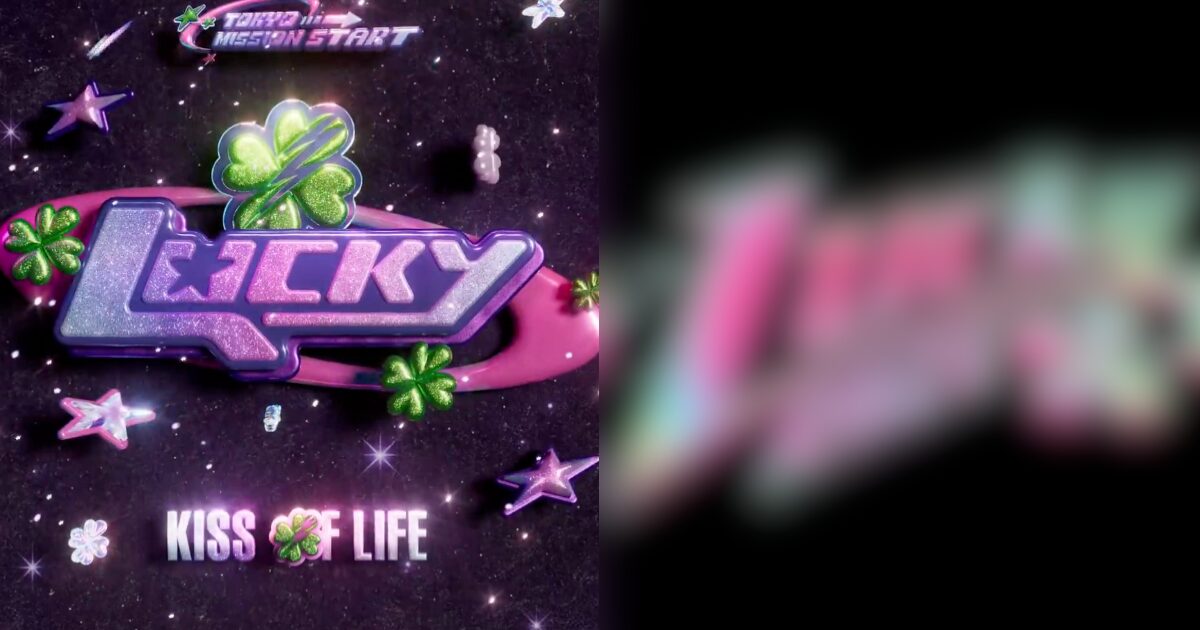
KISS OF LIFE
JAPAN 1st Mini Album
[TOKYO MISSION START]Don’t know how Lucky you are
🍀 2025.11.05 0AM (JST)#KISSOFLIFE #KIOF #キスオブライフ#JULIE #NATTY #BELLE #HANEUL#ジュリー #ナッティ #ベル #ハヌル#TOKYO_MISSION_START #Lucky pic.twitter.com/kKsriaxQCf
— KISS OF LIFE JAPAN (@KISSOFLIFEJP) September 29, 2025
However, many felt that the logo looked too similar to RIIZE‘s logo.

This caused a fierce debate online among fans.
it looks familiar…. https://t.co/MTtFLxGVQG
— 🪩 (@riizepie) September 29, 2025
우리 일본 데뷔곡 첫 앨범 ,, 진짜 소중한데
물론 각 그룹 프로덕션들의 생각이 있었겠지만
준비하고 있었다해도 타그룹이 먼저 냈으면 수정하는게
상도덕 아닌가 ㅠ 보자마자 주저없이 우리 럭키 앨범 생각나버려서 너무 속상했어 🥹 https://t.co/LJUWyyFO2v pic.twitter.com/3yAA0U9ARy— 𝘥𝘥𝘰𝘪𝘯𝘨 (@ddoi_lov3) September 30, 2025
Our first Japan debut album is really precious, and although each group’s production may have its own thoughts about it, it’s only right to change it if another group has used it before…I was sad to see that their logo made us think of our ‘Lucky’ album….
아니뭐가표절이라는건데??너무흔한디자인아님? https://t.co/0n2xH9BVTs pic.twitter.com/eGZaqmn1pJ
— 불루 (@doubledis_) September 30, 2025
I don’t understand what they mean by them plagiarizing. It’s such a common design?
레퍼런스가 비슷할 순 있겠지만 다르다고 봅니다 https://t.co/WCLsjL99cB pic.twitter.com/EFzxv5PNIy
— 🚨 (@Quolla_lla) September 30, 2025
The references might have been similar, but the outcome looks different to me.
핑크초록-흔하지
럭키네잎클로버-흔하지
L이랑 y 글자 밑으로 길게 뺀거- 흔하지
빛나는 연출- 흔하지
글자뒤 둥근 심볼- 흔하지
일본 첫데뷔- 모든 그룹 다 하겠죠근데 이게 다 겹치니까 문제되는 거 아닌가? 전혀 비슷한게 없다는 사람들은 뭘.. 보고있는거지 https://t.co/cE6QO7wBPm
— 망극 (@rzmangeg) September 30, 2025
Pink and green are common. A four-leaf clover is common. Elongating the L and the Y is common. The light effect is common. Symbols behind the letter are common. Making a Japanese debut is something that most groups will do eventually. But isn’t it a problem if all of these overlap? I don’t understand the people saying that it’s not similar…
However, most netizens felt that the designs were totally different.


- “I’m a designer and they look so different. The only thing that’s the same is the word.”
- “I was shocked that it looked so different.”
- “I majored in design and this is absolutely different.”
- “Not plagiarism at all.”
- “Where’s the debate?”
- “Both of them are don’t look the same at all.”