IVE’s Wonyoung Triggers Poor Reactions With Her New Logo Trademark

IVE‘s Wonyoung recently trademarked a logo for her unknown project called FOREVER:CHERRY.

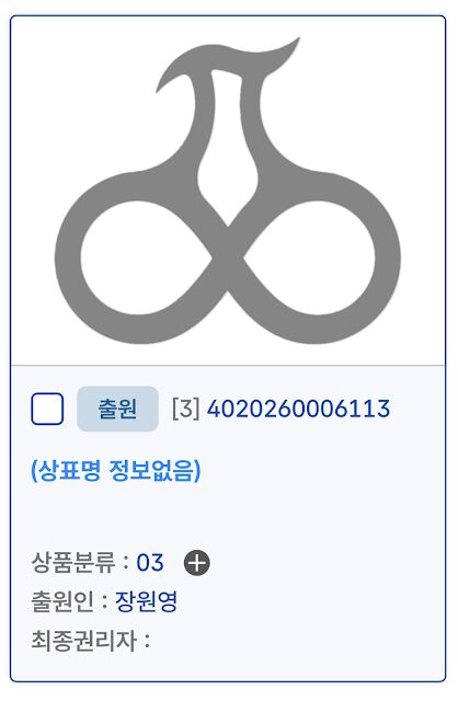
The logo was revealed to be a cherry. It was made taking the first letter of each syllable of Wonyoung’s name in Hangul (ㅈㅇㅇ) and combining them to form this shape.
Additionally, the name “FOREVER:CHERRY” was trademarked.

There is also a list of items that give off the vibe of a lifestyle general store brand like Daiso, including beauty and wellness (cosmetics, skincare, fragrance) and home and utility (cleaning tools, oral care, lifestyle and decor).

Many netizens found the logo to reflect the vibe of a lingerie brand and even have a “sexual” connotation.
- “The logo looks way too much like a bra…”
- “I thought the logo was underwear..? But the products feel more like perfume, air fresheners, soap, or hand wash.”
- “Is that a bra?”
- “The logo really isn’t pretty, it looks like a bra… I thought maybe it was for underwear or swimsuits, but that doesn’t seem to be the case either.”
- “The logo really looks like a woman’s jaw, neck, and chest…”

Many questioned if the fans would like the branding while others were confused about the unexpected product lineup.
- “Wow, there’s no way fans are going to like this.”
- “The logo is kind of… something.”
- “The logo looks so much like a nightshirt.”
- “The logo looks like a chest.”
- “But why are the product types like that?”
- “It looks like testicles.”
